MA Journal
Animate CC with Teegan
During our lesson, we had to make a background in different layers.

Artist Research and Visual Exploration
For my artist research and visual exploration, I decided to choose two artists who’s art styles may differ from one another, but are visually striking in their own unique way. My first artist I chose is Gerold Scarfe. Sacarfe is a British cartoonist and illustrator, who worked as an editorial cartoonist for Sunday Times and ‘New Yorker’. One of his most notorious early works was designing and animating Pink Floyds music videos. His most notorious work he involved himself in was being a production designer for Disney’s Hercules in the mid 90s. What I really love about Scarfe’s art style is how much energy and motion it has despite them being still paintings. A prime example of this is his early concept work for Hercules. One particular character, ‘The Hydra’, stood out the most when I looked into his work.

Despite this being a still painting, it has this sense liker it’s moving. The wave like lines and line of action used really shows the motion in the character. He seems to put more focus and detail on the characters face. And then as we look down, there is less and less detail. All the heads are facing the same direction and the line art all follows the same direction, making it look like it’s going to attack. Another reasons why I like his art style is the surreal and edgy look to his designs. He loves to exaggerate character’s body proportions and loves playing with shapes.
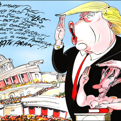
A more recent one is one of his designs on Trump. The way he shapes the head and body shapes, really has this grosque look to it. It will also look appealing if animated, as those way lines can really be exaggerated in animation.
My second artist that I chose is Mary Blair. She was an American artist,animator and designer, who was producing art for the Walt Disney Company such as Alice in Wonderland and Peter Pan. Mary Blair’s art style is very appealing on the eyes. Despite her being a character desaigner, her main focus is of background art and landscapes. Her art is appealing because of the use of colours and shapes. Some of her nature/building designs have human like personallites. One design she made for a short called The Little House (1952) shows how much personality buildings have.

She designs the houses in a way that make them look human. Her use of colurs is also very striking. She ads colour and detail on the buildings, while the background, like the sky is very dark and bland. She does this to really make the main centre pieces stand out.
In terms of how similar the two artists are, I would say in how they approach colour and how the use of colours show how the character is feeling. Mary Blair’s designs seem to be focused towards children, as she has done children book illustrations, so that requires the use of vibrant colours that pop. Scarfe also uses colours in a way to exaggerate his designs even more. An example of this is one of his designs he made for Pink Floyd’s The Wall album.
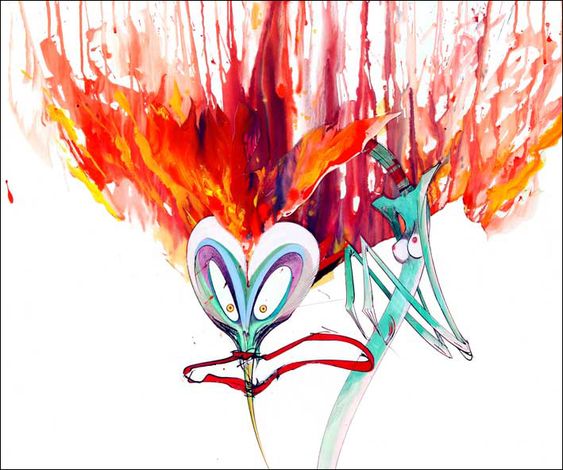
This character is a pretty angry looking character and he uses fire like colours of the hair of the character to really emphasis how the character is feeling. Mary Blair does this same principle, but with her backgrounds. An example is her early concept work for alice in wonderland.
In this painting she made, Alice is entering a bright vibarant house.Despite this house looking amazing on the inside, Alice has never seen or been inside it, so it has this chilling sense of unknown to what may be inside. That’s why the backdrop of the trees and sky are very dark and muted colours. It’s to represent how the character is feeling.
However, the two artists designs have very different and jarring styles. While Mary Blair’s designs don’t have out lines and have a very soft and smooth look to it, Scarfe’s designs have a very rough, jagged look to them.
Visual Exploration
These 3 paintings by Gerald Scarfe is what my main character design will be based upon. These designs have the most energy and best line style that will inspire me to make my final design.


My Rough Designs
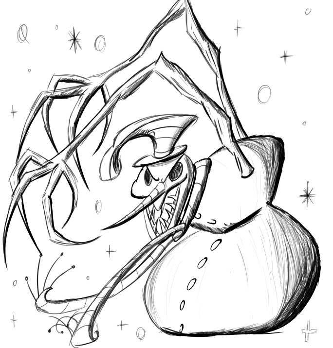
I decided to practice doing the line style by designing original charcters. The top one shows a hybrid of a lizard and a pelican eating a fish. The bottom one shows a really creepy snowman. Scarfe’s designs are always surreal and creepy and the body propotions are always exaggerated so I decided to work on those.

On the left, we have Scarfe’s original desgin and on the right, it’s my remake design.


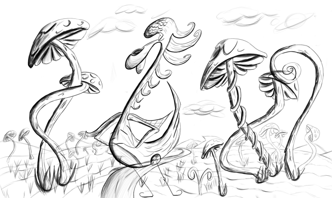
Here are some more concept designs I made.


Remaking the Original
On the inspiration page, I decided to choose one of the drawings and try and practice drawing in his style. This image is my final result of it. I found both enjoyable, yet challenging. Scarfe’s designs are all hand painted, so I had to try and emulate that painty look to it. Since I designed this in photoshop, it is a digital design which was challenging to make it look rough. I had to alter the brush size and change it to make it look a bit scattery. The outline was the most fun to draw, as his outlines on some of this drawings have a roughness to them.


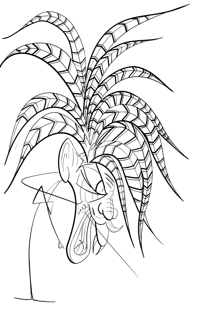
On the left, is an early concept of Scarfe’s Hydra creature made for Disney’s Hercules (1997). On the right, I made an original concept based on his work.


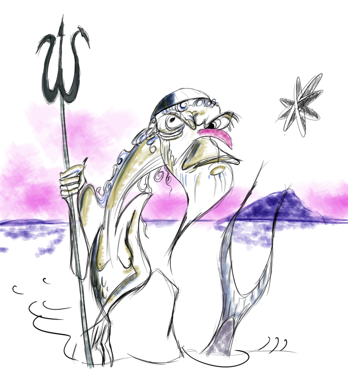
Once I did the previous illustration, I went on and created an original design. I decided to design an old man with a city on his nose. This design was inspired by the instragram channlenge ‘Inktober’, where every day in October, we make a drawing based on a theme for the day. This certain day was build and I wanted to add a city on his nose, as it shows the wacky/surrealness of Scarfe. Based on his merman painting, I painted in a similar style to his.
Mary Blair Research
Once I finished doing the Scarfe work, I went on a researched more into Mary Blair’s designs. I wanted to focus on making the background in her design and make the main character of the piece in Scarfe’s design.


Recreating her work
On the left, we have her original design. On the right is my remake of her design.


After doing the Scarfe designs, I went on and started practice designing in her style designing in her style. Her style has this children book like look to it. I wanted to play on shapes and colours and chose the colours form her work, while coming up with original designs. I made the buildings look alive, as this is seen in her work as well.


Combing the Two Artists into one
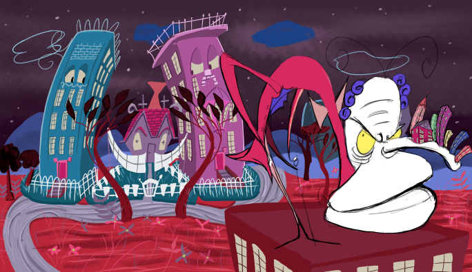
When creating the final look, I had a few issues which resulted in the designs looking different to the early concepts. I decided to get rid of the black outline on the buildings, because, when I researched more into her artwork, I noticed that she doesn’t really use black outlines in her drawings. I also changed the colour design of my Scarfe character to help blend it with the background. When I tried using Scarfe’s colour design approach, it didn’t look right with the soft background of Mary Blair. I made the sky a very dark and dull colour to make the colours in the foreground pop out more, which is what Mary Blair does in her work.
After the previous one, I wanted to explore more into mary balir’s background design, as I feel like I focused more on Scarfe’s designs. This design was mainly inspired by the Disney film Alice in Wonderland (1951), as her artwork was used for that film.
This scene from the Alice film inspired me to make this artwork.


More of my original Designs
These designs I made were made for the Inktober challenge. The theme of the day was pappten, and I wanted to make a character with some sort of patten on.
")
.png alternative")